Pozor #12 cover

Pozor #12 cover

Pozor #10 cover

Pozor #12 spread

Pozor #10 spread

Pozor #12 spread

Pozor #10 spread
![]()
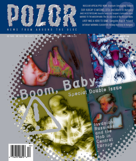
Pozor #12 cover
Pozor #12 cover
Pozor #10 cover
Pozor #12 spread
Pozor #10 spread
Pozor #12 spread
Pozor #10 spread
Praha, Česká republika
The Pozor magazine was published in the Czech Republic in 1996. English-written monthly was published by a group of Americans around the editor in chief, Elizabeth Cornell. The design of the first issues was the work of a team under the leadership of designer Simon Gray, from the fifth issue, it was taken over by an English designer Tony Oleksewitz, who used a variety of pseudonyms. At that time, the production of the magazine was already catered for by Mowshe studio. Starting with the the eight issue, Filip Blažek became the art director of the magazine. ("Typography of the magazine was built on experiment with type, especially in headings, and on deliberate errors, subtle imperfections, inaccurate printing, slightly rotated lines etc. The perfect shapes of digital typefaces then available in our market were not suitable for that. By a strange coincidence, I happened to run into a specimen book of Alois Studnička's typefaces dating back to the end of 19th century in a second hand bookshop in Prague. I was totally taken away by his narrow sanserif, based on seemingly perfect geometric shapes. The typeface fit perfectly into my vision of the Pozor magazine, so I scanned and traced it, and using Fontographer, I transformed it into the typeface Pozorius. The type has proved to be the perfect choice for this magazine. In small sizes, it gave the impression of near-perfection, and, on the other hand, when enlarged, all the tiny discrepancies in drawings of original templates which I retained on purpose stood out. For the following issues, I also prepared a serif typeface based on Studnička's templates, lated named after its creator, Studnička's antiqua. Again, I tried to retain the authenticity of the original drawings." F. B.) Each issue of the Pozor magazine was prepared in approximately two weeks, one exception being the silver issue, which had double volume. The magazine was always printed in black and one spot colour, photos were thus reproduced either in black and white, or as a duplex. The duplex was what became typical for the magazine, at the time, we experimented a lot with this sort of reproduction. It stands out especially in the silver issue.
Years: 1996 – 1996
Number of issues: 12
Publisher: Earwax s. r. o.
Editors-in-chief: Elizabeth Cornell
Editors: Louis Charbonneau
Art director / design: Filip Blažek
last updated 27/2/09